Brand
The Bank™
Deliverables:
Graphic Design, Visual Identity
Year:
2025
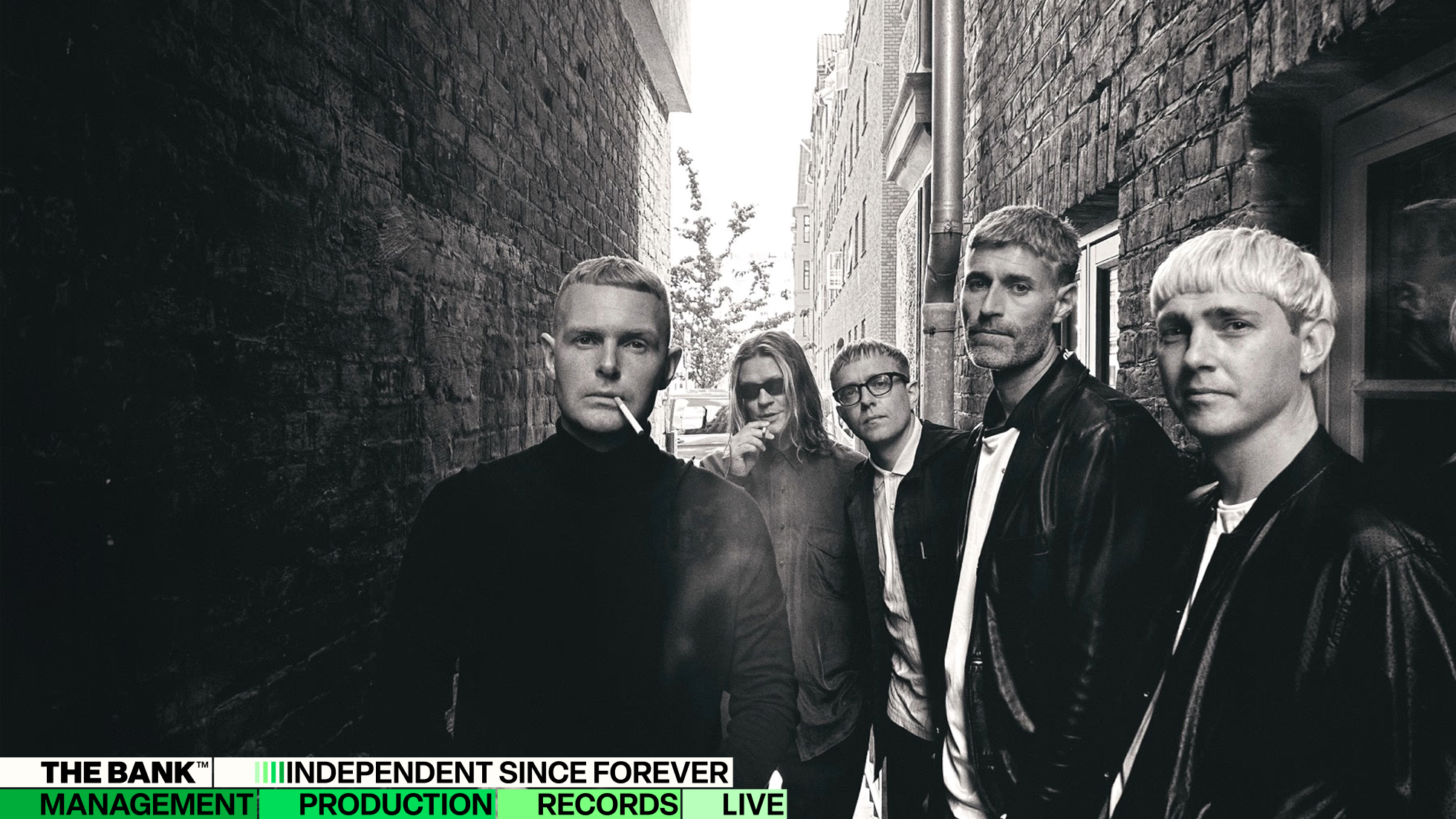
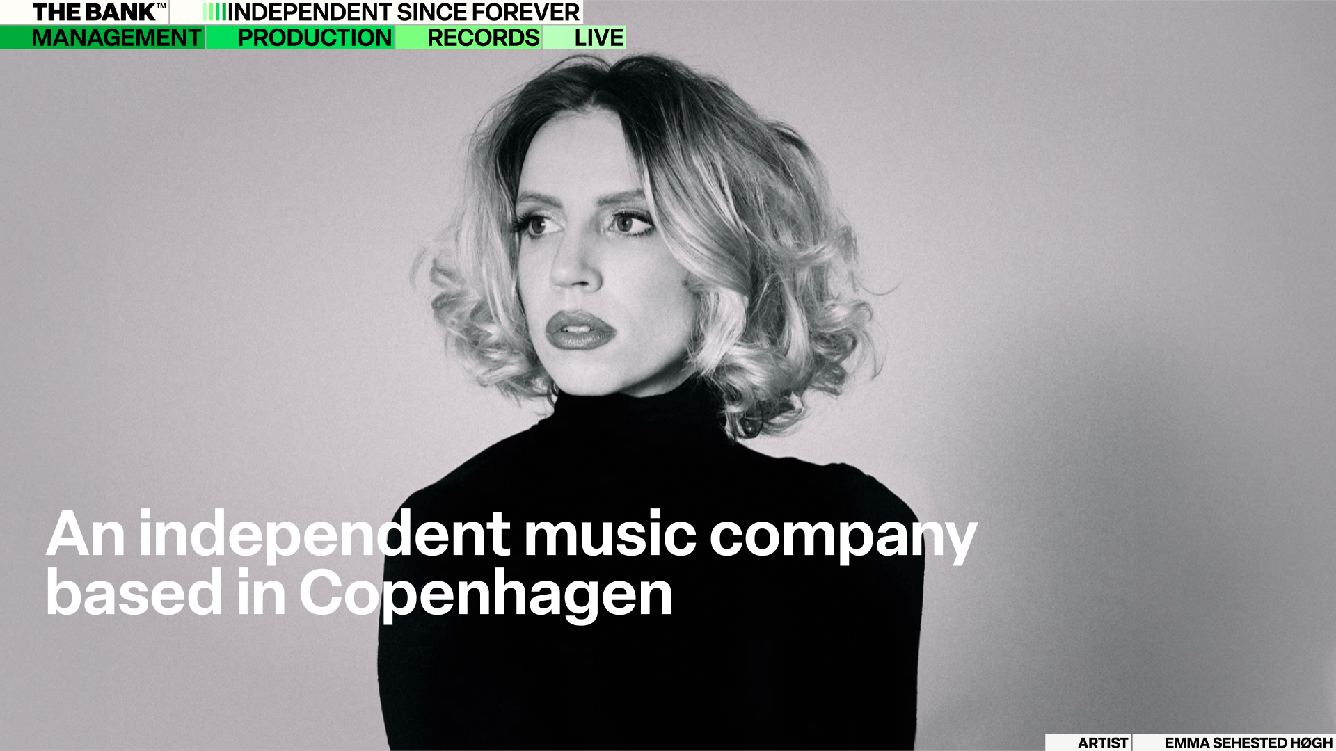
The Bank™ was founded in 2015 to create an independent alternative to the international majors. It is a full-service music company based in Copenhagen, spanning management, production, records and live.
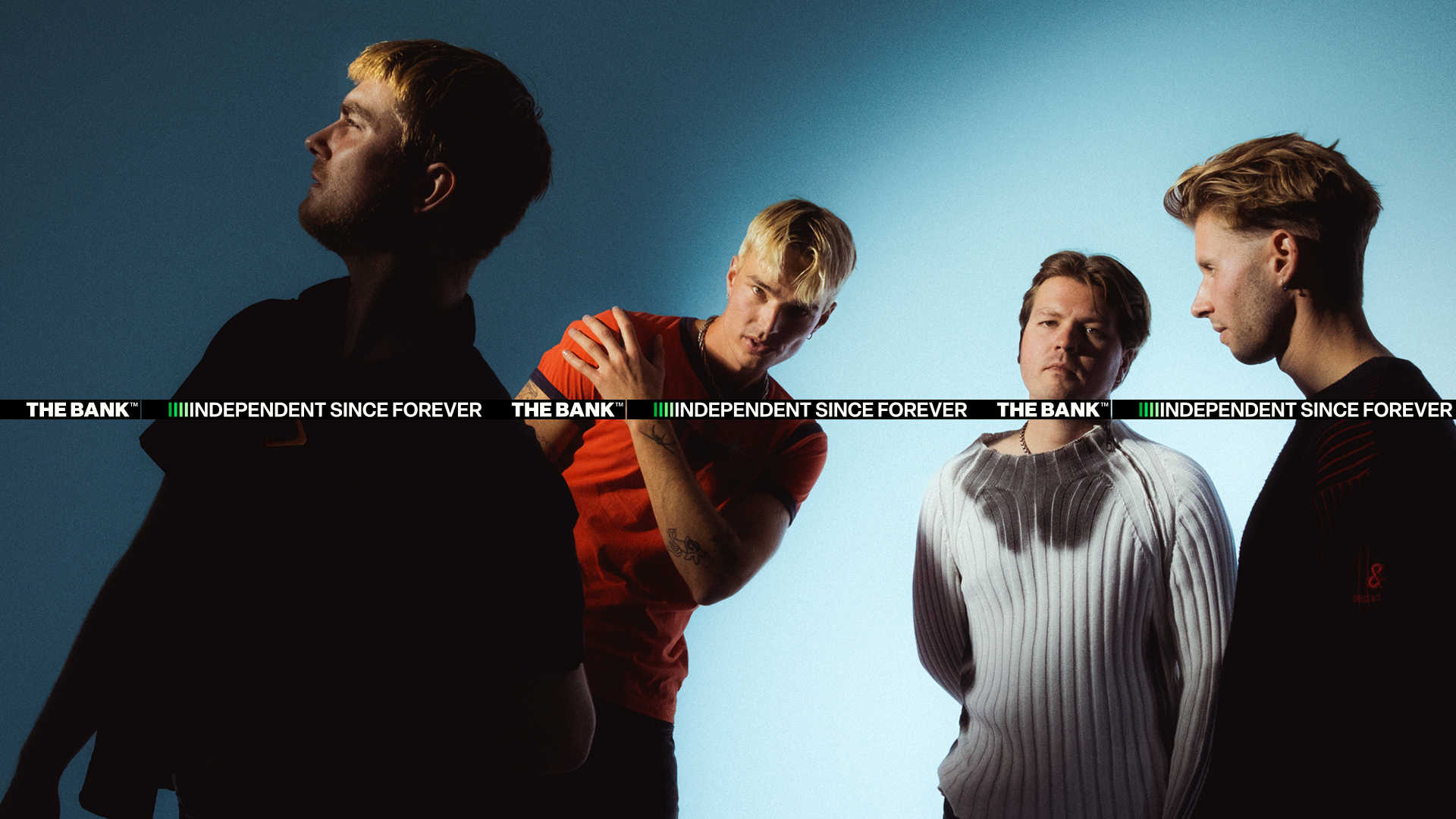
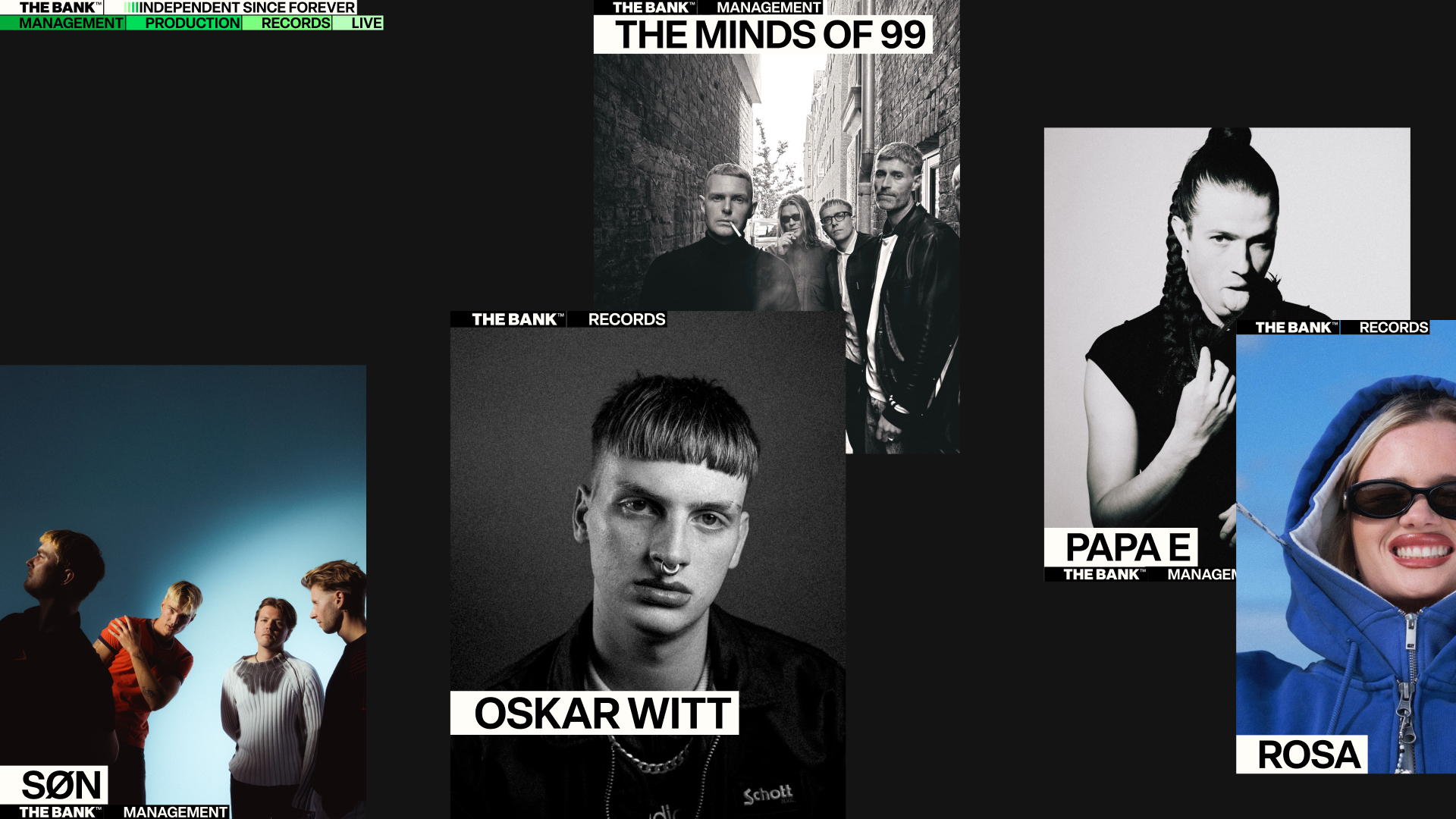
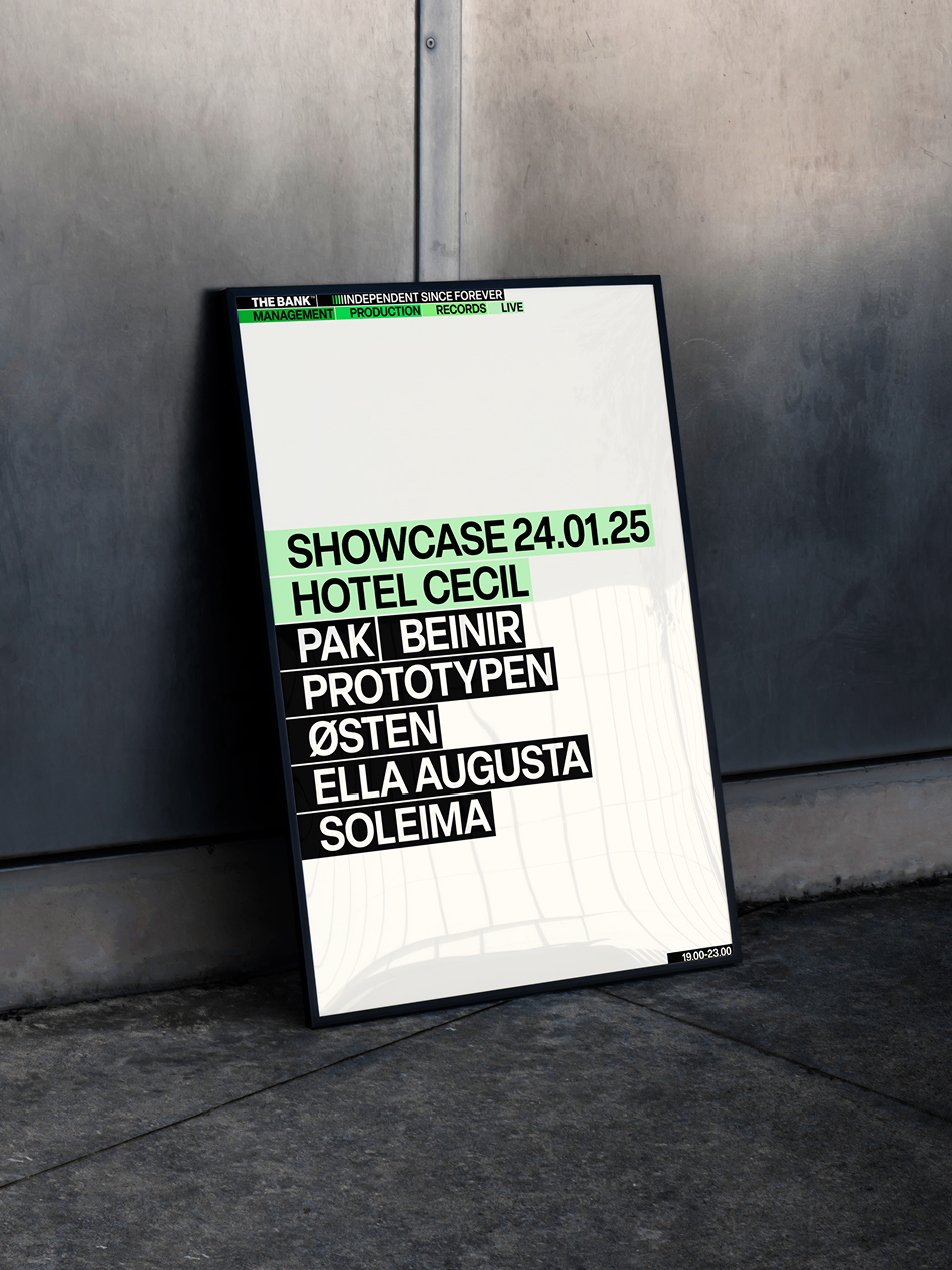
The music company has grown into Denmark’s largest independent player, not as a goal in itself, but as the result of consistently prioritising quality and artistic integrity over the past decade. The new visual identity had to hold all four departments together with a strong sense of unity and cohesion.
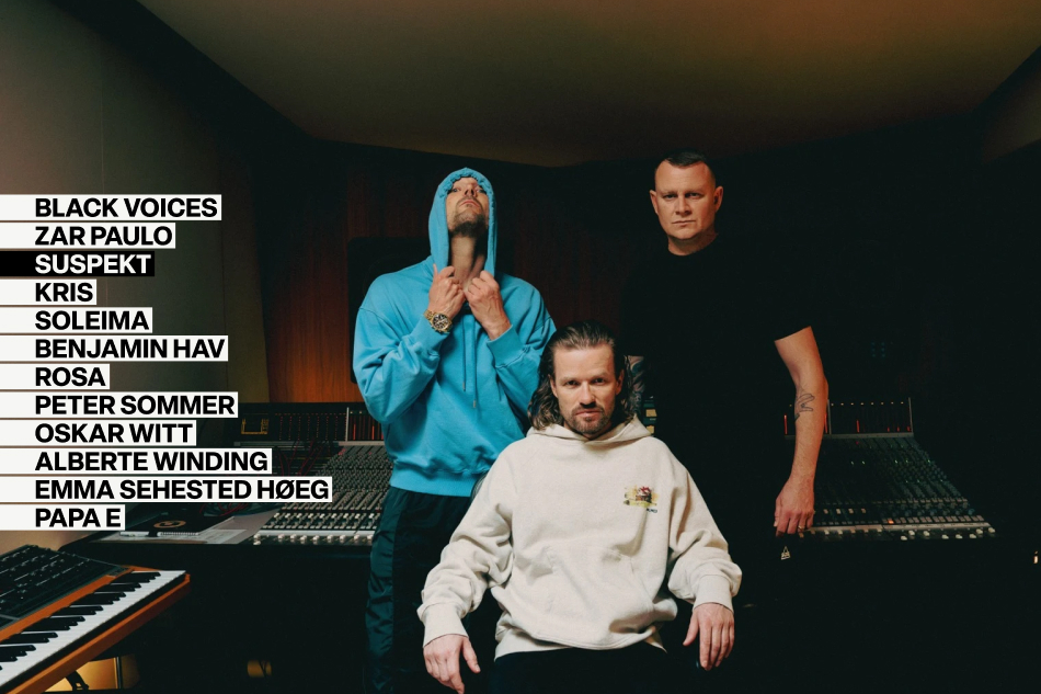
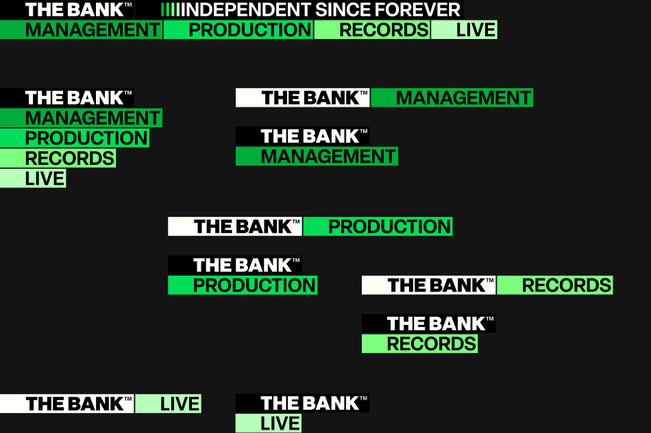
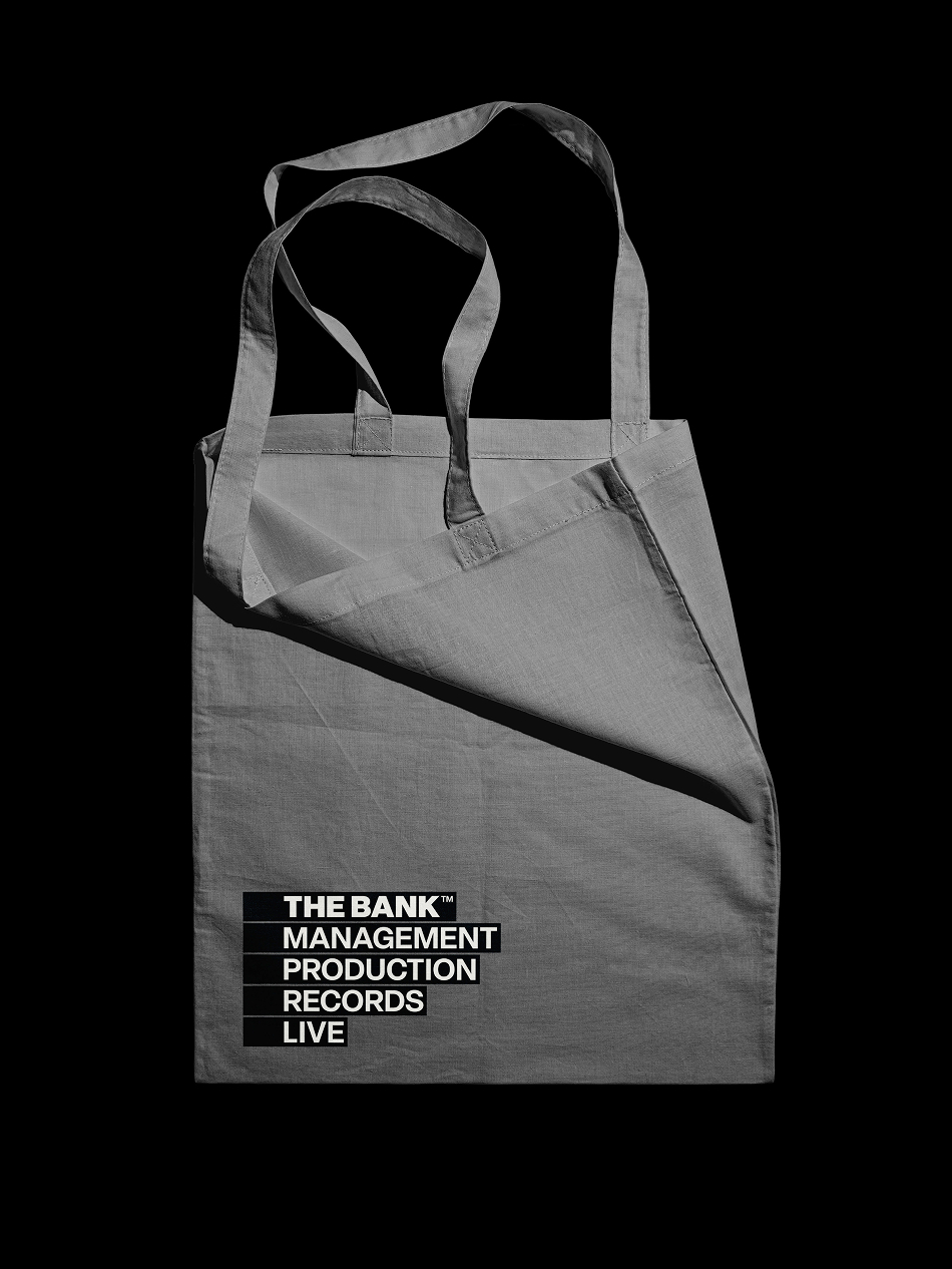
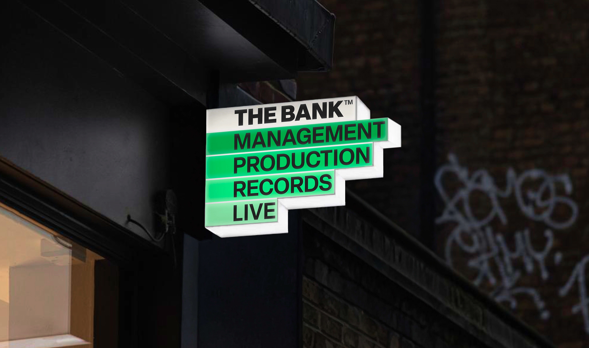
The logo sits at the core of the visual identity: four pillars standing side by side like records lined up on a shelf, making the roster visible. It puts the artists first, a fixed and unshakeable point of reference for the people The Bank™ represents. Set in motion, the same shapes begin to move like sound itself.
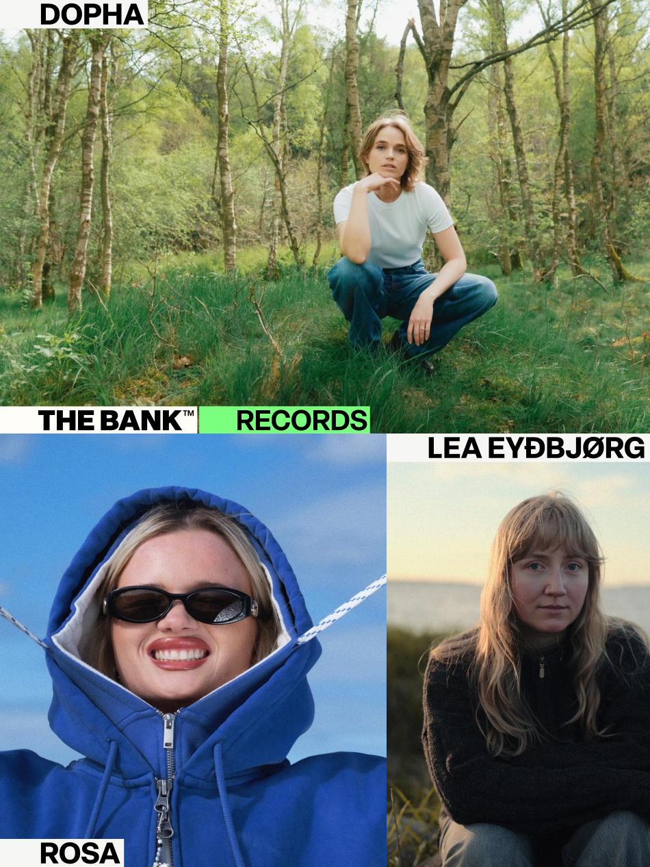
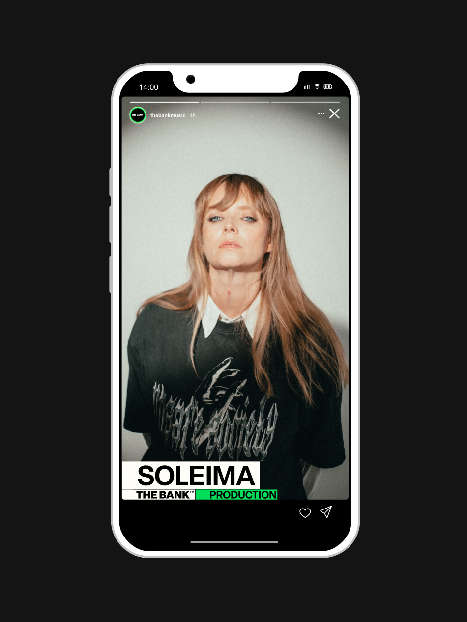
The identity is set in a neo-grotesque typeface with no strong personal traits or distinguishable features. Its neutral character allows the artists to take centre stage. The result is a system cohesive enough to unify all four departments, yet flexible enough to let each one speak in its own voice. An identity built around the artists and the independent spirit at the heart of The Bank™.


Brand
The Bank™
Deliverables:
Graphic Design, Visual Identity
Year:
2025
The Bank™ was founded in 2015 to create an independent alternative to the international majors. It is a full-service music company based in Copenhagen, spanning management, production, records and live.
The music company has grown into Denmark’s largest independent player, not as a goal in itself, but as the result of consistently prioritising quality and artistic integrity over the past decade. The new visual identity had to hold all four departments together with a strong sense of unity and cohesion.
The logo sits at the core of the visual identity: four pillars standing side by side like records lined up on a shelf, making the roster visible. It puts the artists first, a fixed and unshakeable point of reference for the people The Bank™ represents. Set in motion, the same shapes begin to move like sound itself.
The identity is set in a neo-grotesque typeface with no strong personal traits or distinguishable features. Its neutral character allows the artists to take centre stage. The result is a system cohesive enough to unify all four departments, yet flexible enough to let each one speak in its own voice. An identity built around the artists and the independent spirit at the heart of The Bank™.


More projects
west Back to works

Hey Jack Studio
Vodroffsvej 19
1900 Frederiksberg
contact@heyjack.dk
application@heyjack.studio
Katrine Rosendal Hayden: (+45) 31 52 73 10
Signe Jacobsen: (+45) 60 56 06 85
© 2023 Hey Jack Studio
west Back to works

Hey Jack Studio
Vodroffsvej 19
1900 Frederiksberg
contact@heyjack.dk
application@heyjack.studio
Katrine Rosendal Hayden: (+45) 31 52 73 10
Signe Jacobsen: (+45) 60 56 06 85
© 2023 Hey Jack Studio