Brand
Betty Nansen Teatret
Deliverables:
Design Strategy, Graphic Design, Visual Identity, Logo, Webdesign, Print, Facade Signage, Art Direction, Photography, Video
Year:
2026
Credits:
Design strategy by Katinka Bukh
Living Portraits by Anton Lauritsen
Web dev by Eksakte
Typefaces used:
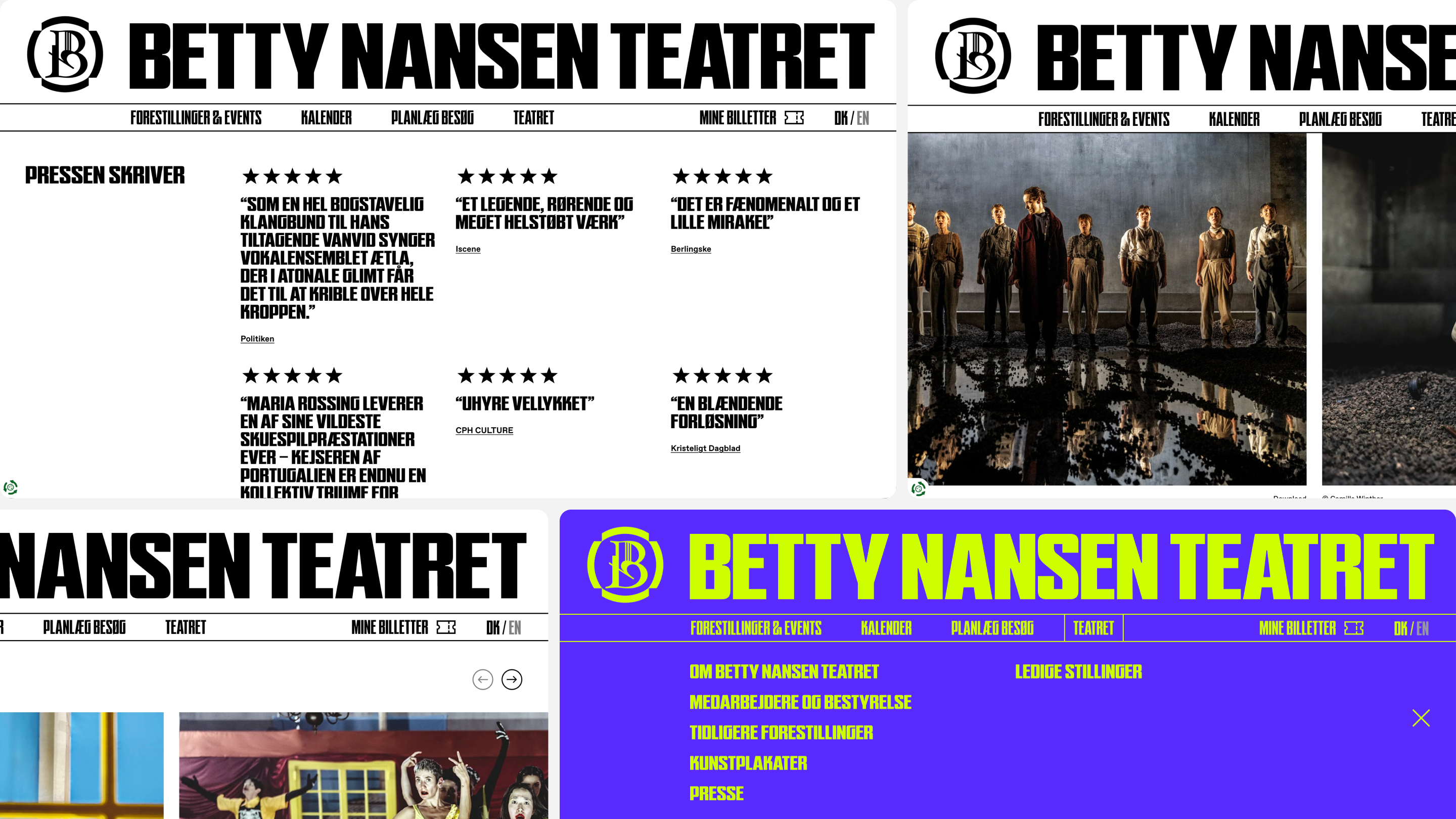
Skrappa by WiseType®
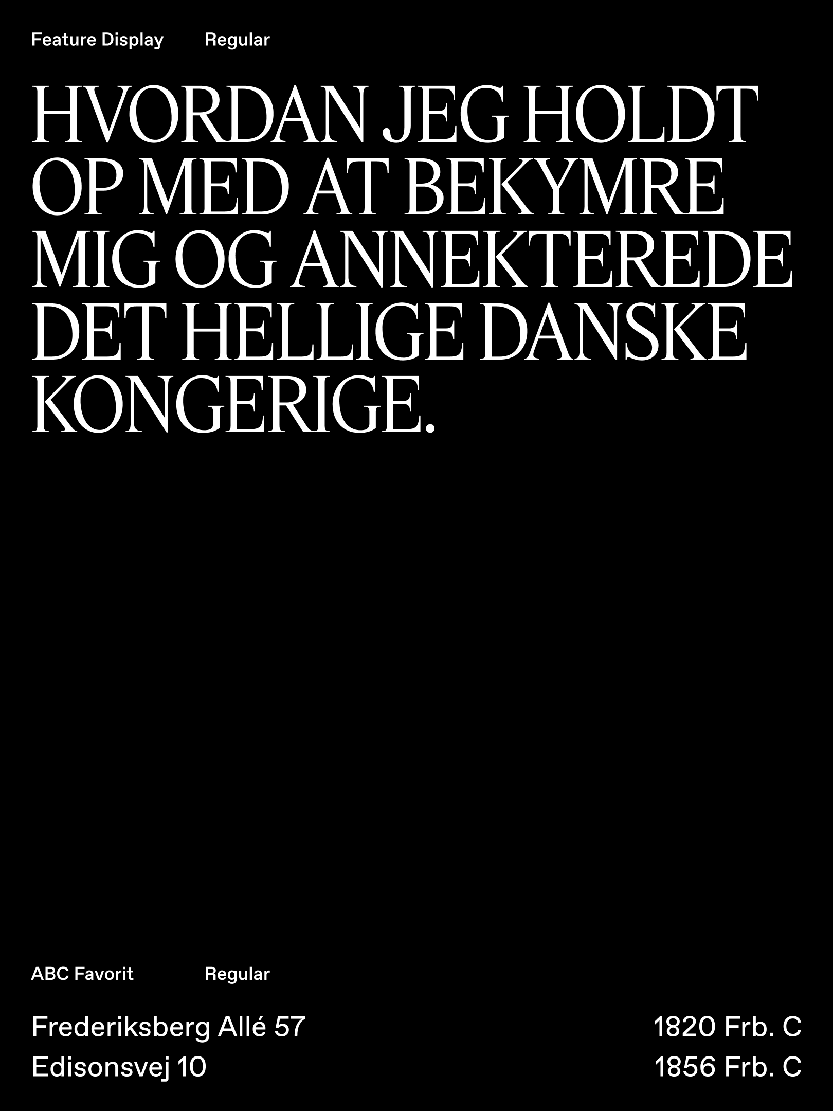
Feature Display Regular by Commercial Type
ABC Favorit by Dinamo
Website:
Betty Nansen Teatret has been part of Copenhagen’s cultural landscape for more than a century. With a new leadership and a renewed ambition to create critical, contemporary theatre, the house was ready for an identity that could reflect a more uncompromising point of view.
The challenge was to create an identity that could hold both sides of Betty Nansen: its deep institutional roots and its desire to challenge the present. Something with the weight of an established cultural institution, but with enough friction to feel alive.
At the centre of the identity is a new symbol inspired by the lyre found in the theatre’s architecture. Rather than simply redesigning the logo, we created a symbol that could stand on its own as a recognisable marker for the house and a central axis for the entire visual system.
The identity is built around the contrast between elegance and aggression.
The colour palette is deliberately restless. Combinations are designed to vibrate, clash and create visual tension rather than simply harmonise.
The photography follows a different approach. Where the theatre previously used imagery primarily to document the stage, we chose to work consistently with black-and-white photography with an art-photographic character. The images are more interpretive, focusing on atmosphere, emotion and composition rather than showing the entire world of a production.


Betty Nansen Teatret also has a new typographic system that doesn’t simply communicate — it insists. A variable display typeface is used across play titles, shifting between strict and unruly, bold and restrained, brutal in its simplicity. This gives each production room to develop its own character and energy, while maintaining a clear thread across Betty Nansen’s programme.


Brand
Betty Nansen Teatret
Deliverables:
Design Strategy, Graphic Design, Visual Identity, Logo, Webdesign, Print, Facade Signage, Art Direction, Photography, Video
Year:
2026
Credits:
Design strategy by Katinka Bukh
Living Portrait by Anton Lauritsen
Web dev by Eksakte
Typefaces used:
Skrappa by WiseType®
Feature Display Regular by Commercial Type
ABC Favorit by Dinamo
Website:
Betty Nansen Teatret has been part of Copenhagen’s cultural landscape for more than a century. With a new leadership and a renewed ambition to create critical, contemporary theatre, the house was ready for an identity that could reflect a more uncompromising point of view.
The challenge was to create an identity that could hold both sides of Betty Nansen: its deep institutional roots and its desire to challenge the present. Something with the weight of an established cultural institution, but with enough friction to feel alive.
At the centre of the identity is a new symbol inspired by the lyre found in the theatre’s architecture. Rather than simply redesigning the logo, we created a symbol that could stand on its own as a recognisable marker for the house and a central axis for the entire visual system.
The identity is built around the contrast between elegance and aggression.
The colour palette is deliberately restless. Combinations are designed to vibrate, clash and create visual tension rather than simply harmonise.
The photography follows a different approach. Where the theatre previously used imagery primarily to document the stage, we chose to work consistently with black-and-white photography with an art-photographic character. The images are more interpretive, focusing on atmosphere, emotion and composition rather than showing the entire world of a production.


Betty Nansen Teatret also has a new typographic system that doesn’t simply communicate — it insists. A variable display typeface is used across play titles, shifting between strict and unruly, bold and restrained, brutal in its simplicity. This gives each production room to develop its own character and energy, while maintaining a clear thread across Betty Nansen’s programme.


west Back to works

Hey Jack Studio
Vodroffsvej 19
1900 Frederiksberg
contact@heyjack.dk
application@heyjack.studio
Katrine Rosendal Hayden: (+45) 31 52 73 10
Signe Jacobsen: (+45) 60 56 06 85
© 2026 Hey Jack Studio
west Back to works

Hey Jack Studio
Vodroffsvej 19
1900 Frederiksberg
contact@heyjack.dk
application@heyjack.studio
Katrine Rosendal Hayden: (+45) 31 52 73 10
Signe Jacobsen: (+45) 60 56 06 85
© 2026 Hey Jack Studio